— Ilya Kashnitsky (@ikashnitsky) October 16, 2021
Dataviz art/skill
Create powerful dataviz with R
Ilya Kashnitsky
Leverhulme Centre for Demographic Science
2022-09-12
@ikashnitsky
— Ilya Kashnitsky (@ikashnitsky) April 2, 2021
My #dataviz course w/ @MPIDRnews & @IMPRS_PHDS starts today. Excited and slightly nervous to deliver to 180+ participants 🙀
— Ilya Kashnitsky (@ikashnitsky) June 14, 2021
The course now has its own account here @DatavizArtSkill
And a hashtag #datavizartskill pic.twitter.com/uPNiFcdIvC


before we start

materials for the course
rule 0 – DO VISUALIZE YOUR DATA
Anscombe’s Quartet

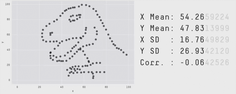
Visualizing summary statistics in a #boxplot is great. But don't forget to explore the underlying data distribution.
— Mihaela Bozukova (@MBozukova) April 27, 2021
Thanks to @JustinMatejka for this great educational dataset.#30DayChartChallenge | #Day27 | #educational #dataviz #Rstats #ggplot2 #statistics #violinplot pic.twitter.com/JfNwMzuash


rule 1 – text should be horizontal

example of a figure improvement


rule 2 – on slides, text should be as large as possible


rule 3 – mind colors, especially regarding colorblind friendliness
https://t.co/KPqzPh06Iq pic.twitter.com/P1YWTIWooR
— Ilya Kashnitsky (@ikashnitsky) May 6, 2020
After 3 years of neglecting them, I am - finally - taking the time to update viridis(Lite). It will come with 3 new and beautiful color maps, all colorblind-friendly. Here is a preview to wait until they ship to CRAN later this week :-) #rstats #dataviz pic.twitter.com/dogF6pi9r3
— Simon Garnier (@sjmgarnier) April 11, 2021
rule 4 – highlight what’s important for the story
Spent way too long trying to work out what was so special about her knee https://t.co/0epzaJeQKk
— Alex Selby-Boothroyd (@AlexSelbyB) June 13, 2021

rule 5 – think about the nature of your data


When #dataviz design choice is not just about aesthetics
— Ilya Kashnitsky (@ikashnitsky) June 28, 2021
Here is my strong opinion on a common issue with excess death plots that I keep noticing and thinking about – Y-axis should necessarily start at 0
Below goes my straightforward reasoning
1/thread pic.twitter.com/2HGY0BXMrf


NOTE – plots don’t have to be overly complicated to be powerful
Climate change is happening now & is happening everywhere. Our lives are already being affected by the warming of the planet.
— Ed Hawkins (@ed_hawkins) April 9, 2021
Human activities are causing these fundamental changes to the climate. Burning fossil fuels & deforestation are the primary reasons.
Our choices matter. pic.twitter.com/SPnkVYq10u


Before this week, such a scene would have been impossible pic.twitter.com/McNlVMdcga
— Tom Freeman (@SnoozeInBrief) September 10, 2022
(not a rule) suggestion
When possible and meaningful for your story
animate
Remade the @WSJ measles vaccination visualization using ggplot2 and the animation package #rstats pic.twitter.com/cnIScD9ymI
— Michael Lee 🚴📊🇷 (@mikeleeco) June 19, 2017
Or make it completely
interactive
Dataviz principles
Jonas Shoeley’s slides
Tidyverse
— Trust me, I'm a "Biologist" (@TrustBiologist) June 13, 2021
The most influential R developer
Hadley Wickham

Pipes: the new way to write R code

TidyTuesday
great examples
✨🧙♂️New #DataViz!
— Cédric Scherer (@CedScherer) July 11, 2022
Design of 13 sets of population pyramids for the report "Rediscovering demographic change" by the Federal Institute for #Population Research @bib_bund illustrating the demographic change in #Germany over 20 years.
Made with #ggplot2 and @figma#rstats #datavis pic.twitter.com/MH2sqqLNd2