
install.packages("tricolore")
library(tricolore)
DemoTricolore()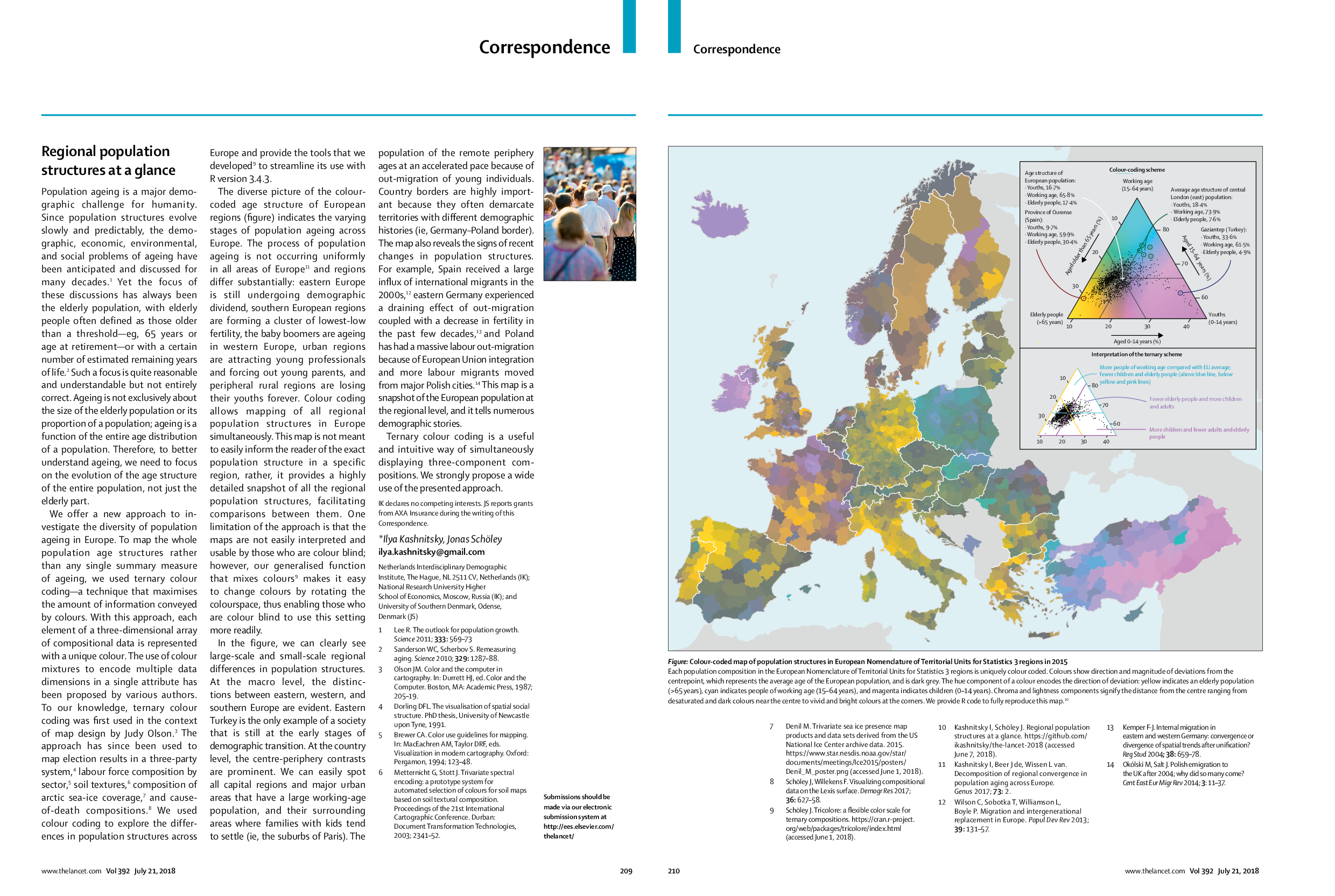
I am happy to announce that our paper is published today in The Lancet.
Kashnitsky I, Schöley J. 2018. Regional population structures at a glance. The Lancet 392: 209–210. https://doi.org/10.1016/S0140-6736(18)31194-2
At a glance
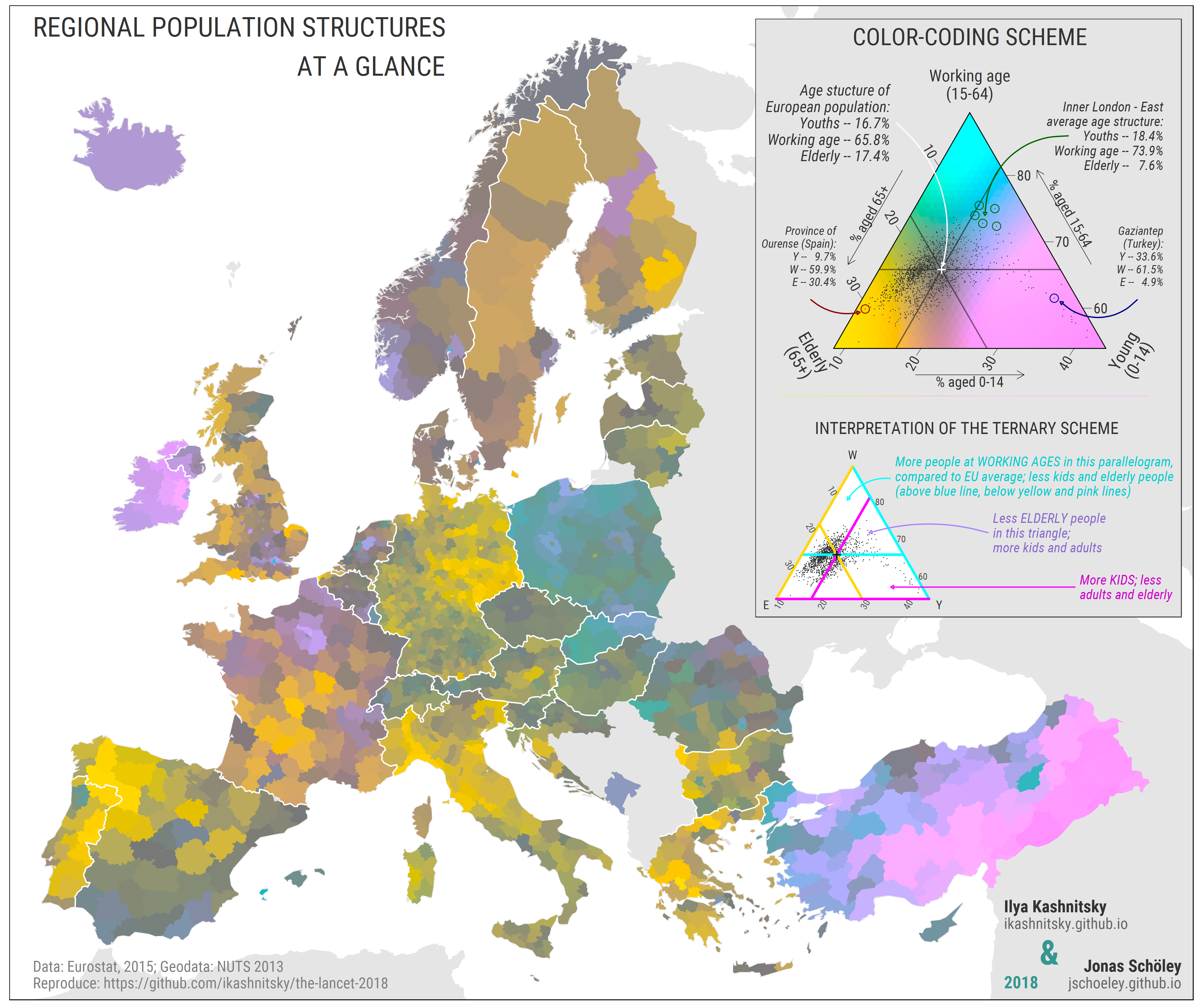
Demographic history of a population is imprinted in its age structure. A meaningful representation of regional population age structures can tell numerous demographic stories – at a glance. To produce such a snapshot of regional populations, we use an innovative approach of ternary colour coding.
Here is the map:
We let the data speak colours
With ternary colour coding, each element of a three-dimensional array of compositional data is represented with a unique colour. The resulting colours show direction and magnitude of deviations from the centrepoint, which represents the average age of the European population, and is dark grey. The hue component of a colour encodes the direction of deviation: yellow indicates an elderly population (>65 years), cyan indicates people of working age (15–64 years), and magenta indicates children (0–14 years).
The method is very flexible, and one can easily produce these meaningful colours using our R package tricolore. Just explore the capabilities of the package in a built-in shiny app using the following lines of code:
Replication materials at github
Folow us on Twitter: ikashnitsky, jschoeley
See also
- My PhD project – Regional demographic convergence in Europe
- Blog post on the first version of the map presented at Rostock Retreat Visualization in June 2017
- Paper (Schöley & Willekens 2017) with the initial ideas for tricolore package
- An example of ternary colorcoding used to visualize cause-of-death data
- My other paper , which explores regional differences in population age structures